Bygone Whiskey
Hand-crafted American whiskey with an old-soul heart — a barrel-and-laurel crest, a considered label system, and a three-screen subway takeover that moves.
- Client
- Bygone — hand-crafted American whiskey (concept brand)
- My role
- Designer — identity, packaging, label & OOH motion
- Scope
- Crest & wordmark · label system · bottle & carton · animated subway OOH
- Year
- 2024
- Disciplines
- Packaging · Brand Identity · Motion Design
Overview
Bygone is built on nostalgia without the cliché — a whiskey that feels handed-down, not manufactured. The name does the heavy lifting; the identity keeps it honest with a hand-tooled barrel-and-laurel crest, a classic high-contrast serif wordmark, and warm oak tones pulled straight from the barrel.
The system had to work in two very different registers: intimate and tactile on the shelf, then bold and legible flying past a subway platform at speed.
The mark
A barrel framed by a laurel — craft and provenance in a single lockup. Set against a stately serif wordmark and locked to the line Hand-Crafted American Whiskey. Designed to emboss, foil, and reverse cleanly at any size.
Packaging
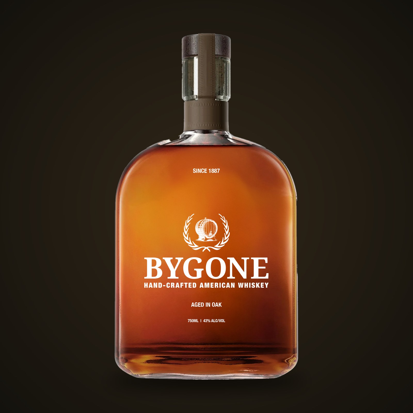
The label pairs the crest with the wave device below — a nod to the barrel char line and the pour itself — printed on uncoated, lightly toothed stock so it reads aged in the hand. Oak tones and cream carry across bottle, carton, and closure.
Three screens,
one pour.
The subway takeover treats three sequential platform screens as one canvas: the wave carries a pour left-to-right across all three as a train's-eye view would catch them — the crest resolving on the last. Motion tuned to the rhythm of the platform, not the desktop.