Brooklyn SoftBoys
A streetwear brand with a thesis: in a city trying so hard to be hard, make clothing for people who embrace the softer side of life. One idea — stay soft — taken from wordmark to storefront.
- Client
- Brooklyn SoftBoys — self-initiated brand
- My role
- Founder & Designer — identity, illustration, apparel, packaging, web
- Scope
- Naming & wordmark · brand book · apparel graphics · wheatpaste campaign · Shopify storefront
- Year
- 2026
- Disciplines
- Brand Identity · Illustration · Art Direction · E-commerce
Overview
Brooklyn SoftBoys is where I get to be client, creative director, and designer at once. The whole brand hangs on a manifesto — "in a world where everyone's trying to be hard, we make premium clothing for people who embrace the softer side of life. Stay soft."
That tension — soft message, hard city — drives every decision: a rough, hand-lettered wordmark; washed, vintage-weight garments; tarot iconography reworked with a wink; and a rollout that lives on plywood walls, not billboards.
Identity system
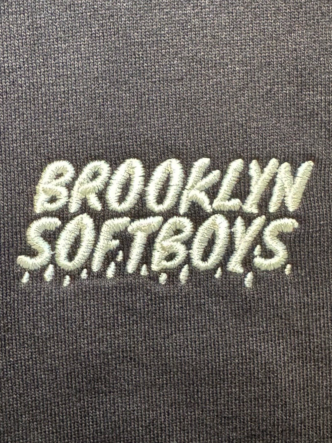
The brand book pairs a rough marker wordmark against disciplined DIN Condensed supporting type and a restrained palette — warm greige and charcoal, so the apparel graphics can carry the colour. Structure underneath, softness on top.
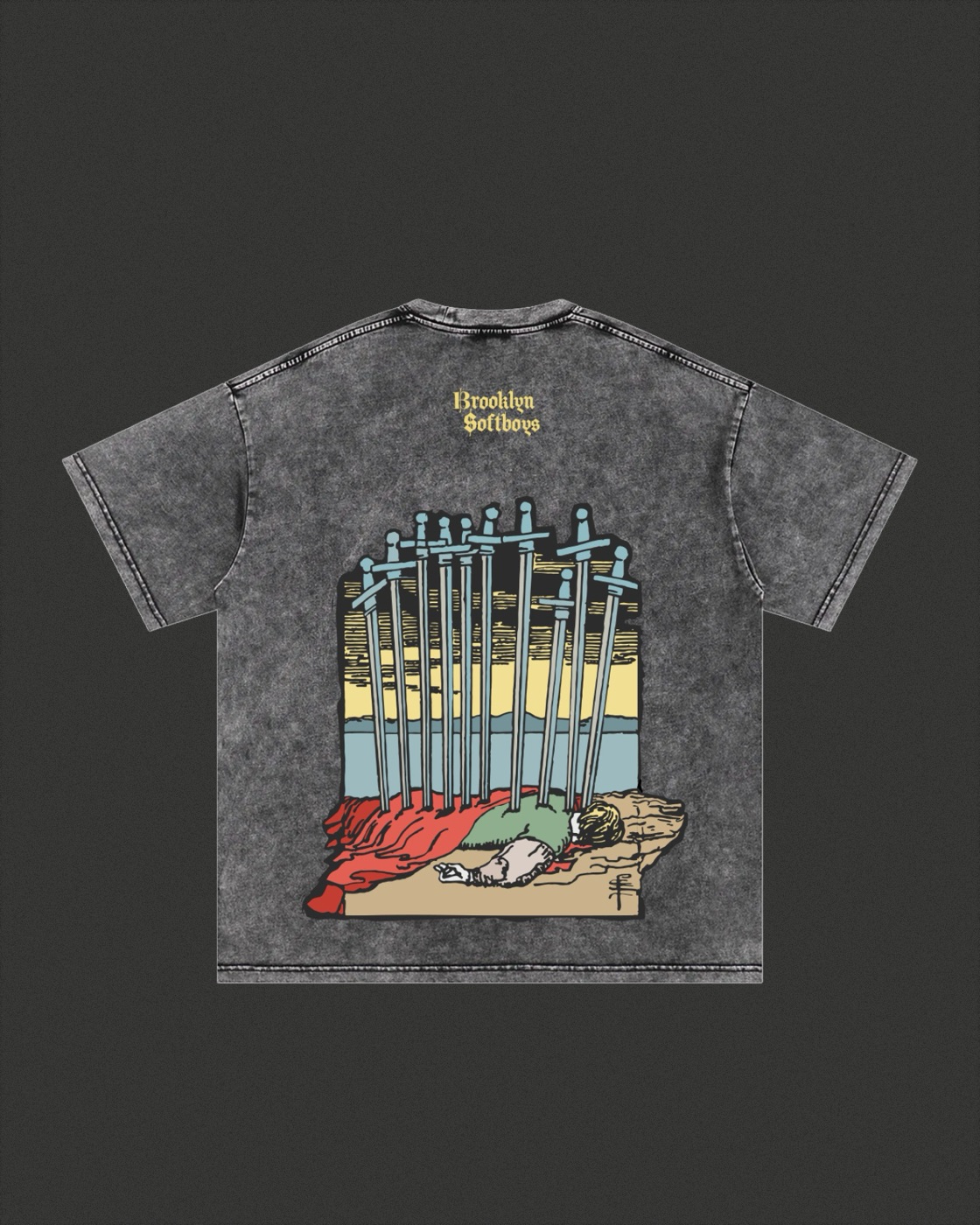
Ten of swords,
softened.
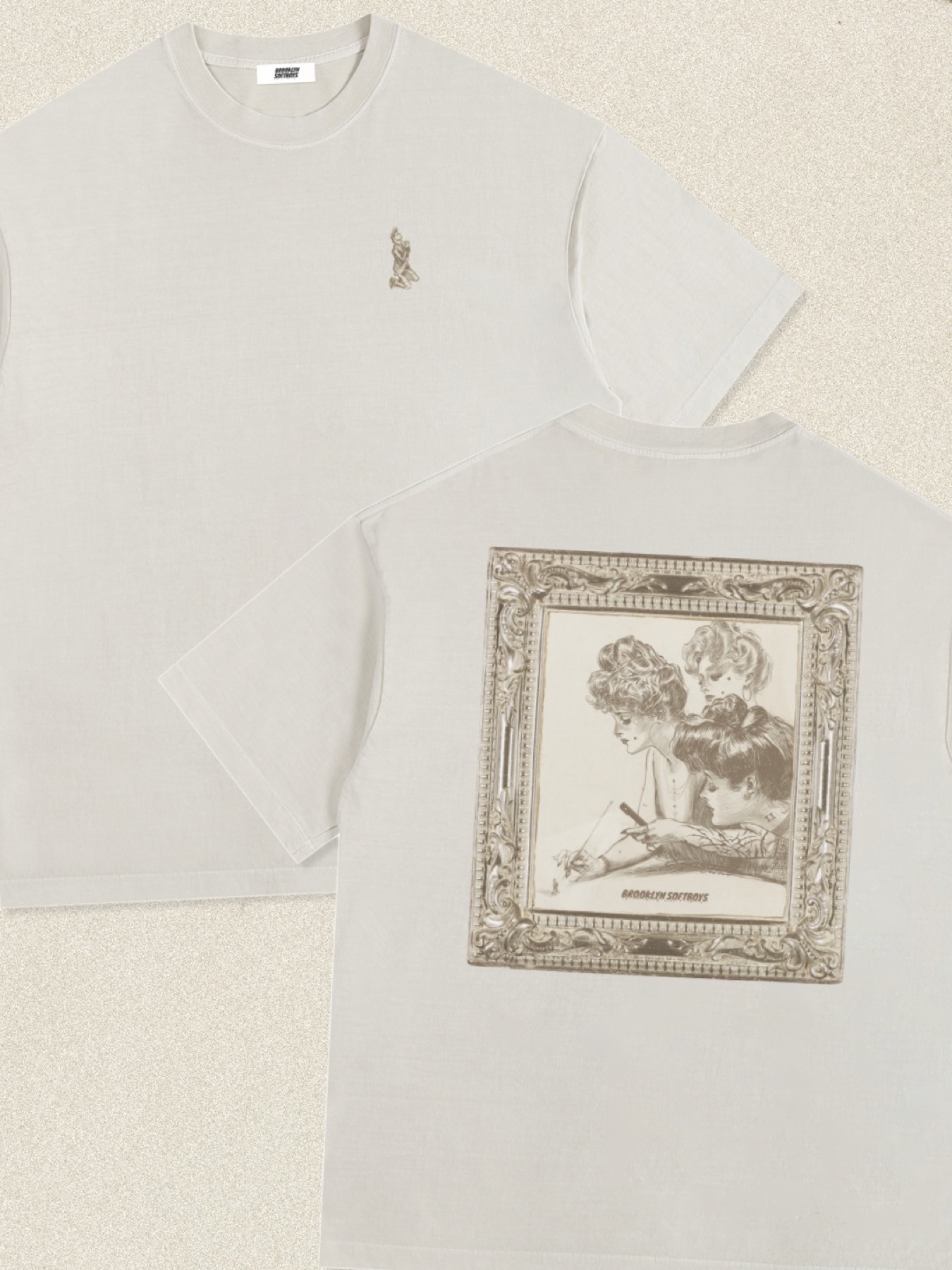
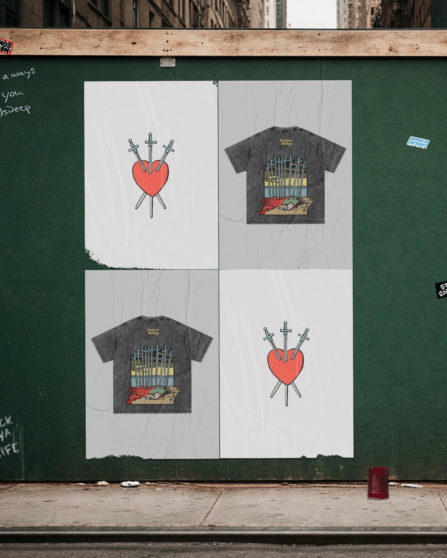
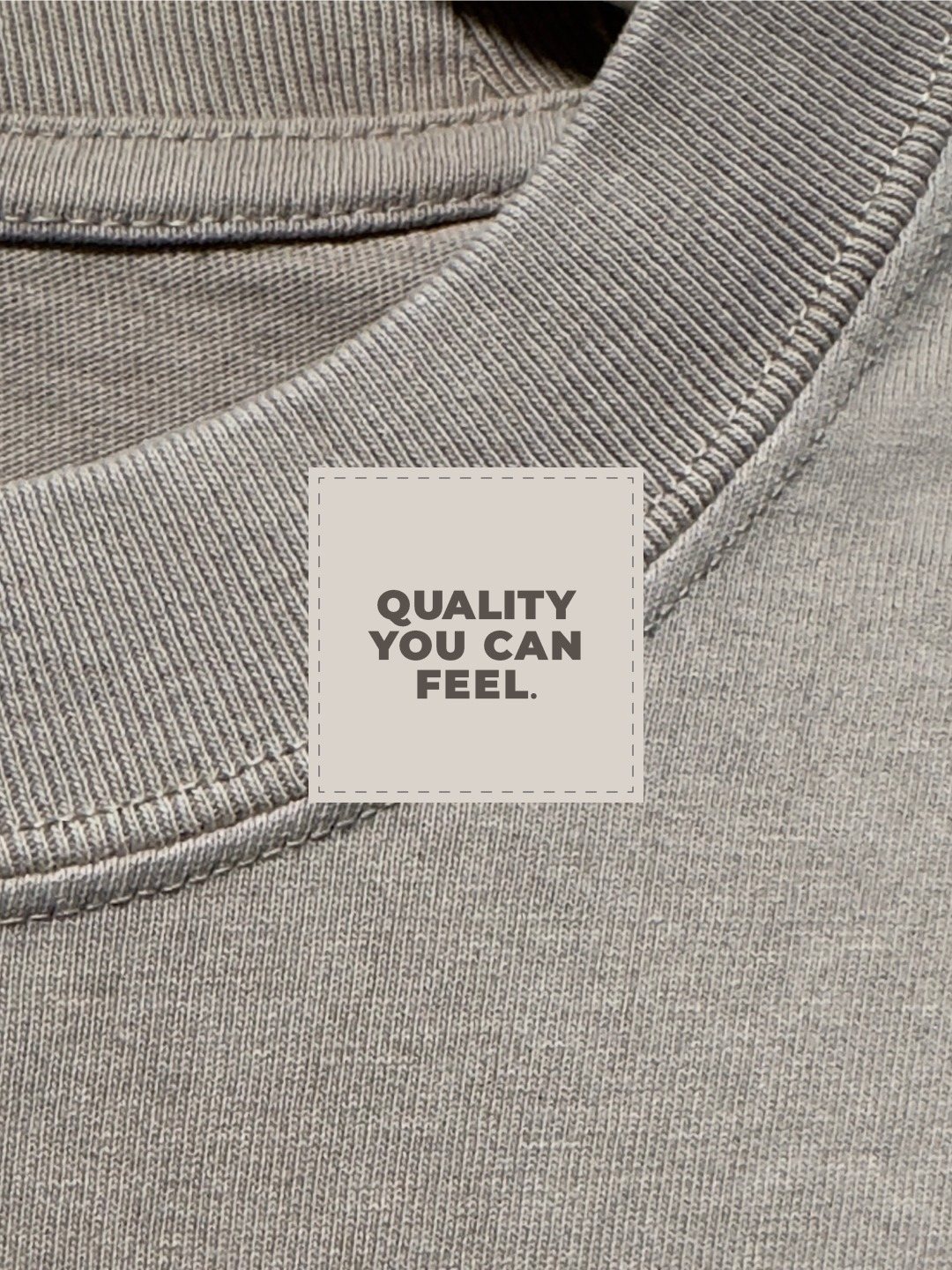
The hero graphic reworks the tarot's Ten of Swords — traditionally the card of rock-bottom — into something almost tender. Printed on heavyweight, mineral-washed tees so every piece feels already broken-in.
Campaign
No media buy — the launch lived where the brand does, on the street. Apparel graphics were blown up and wheatpasted on a construction wall, photographed as they weathered. The medium is the message: unpretentious, a little rough, real.

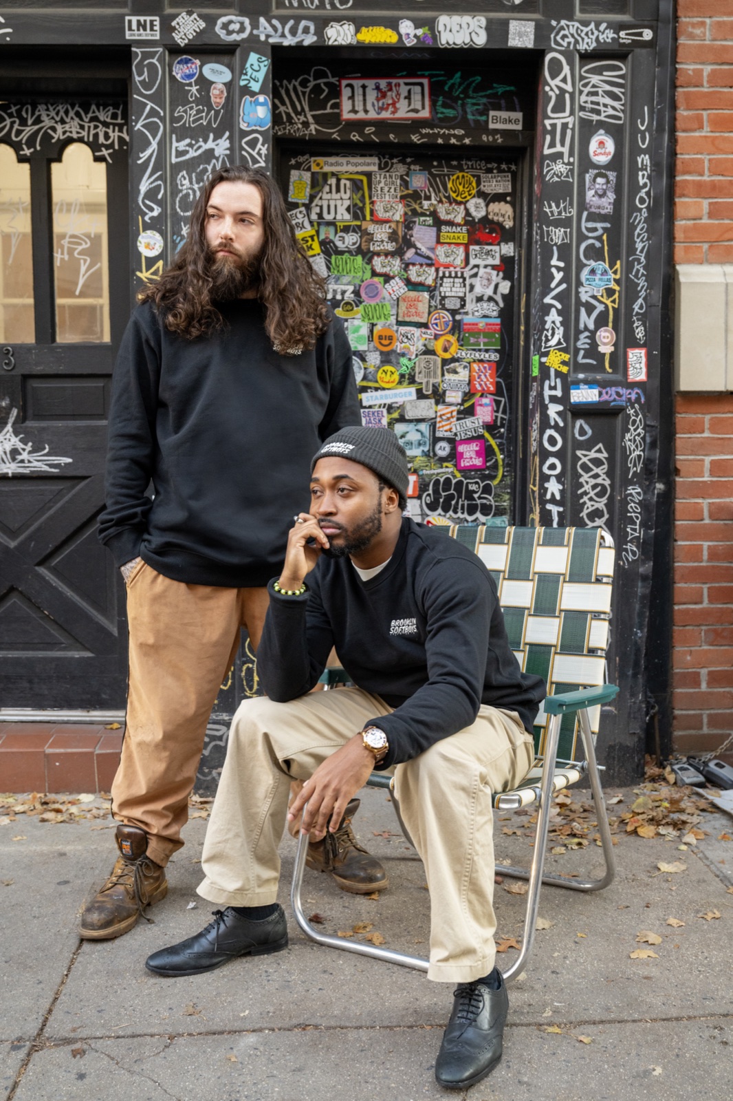
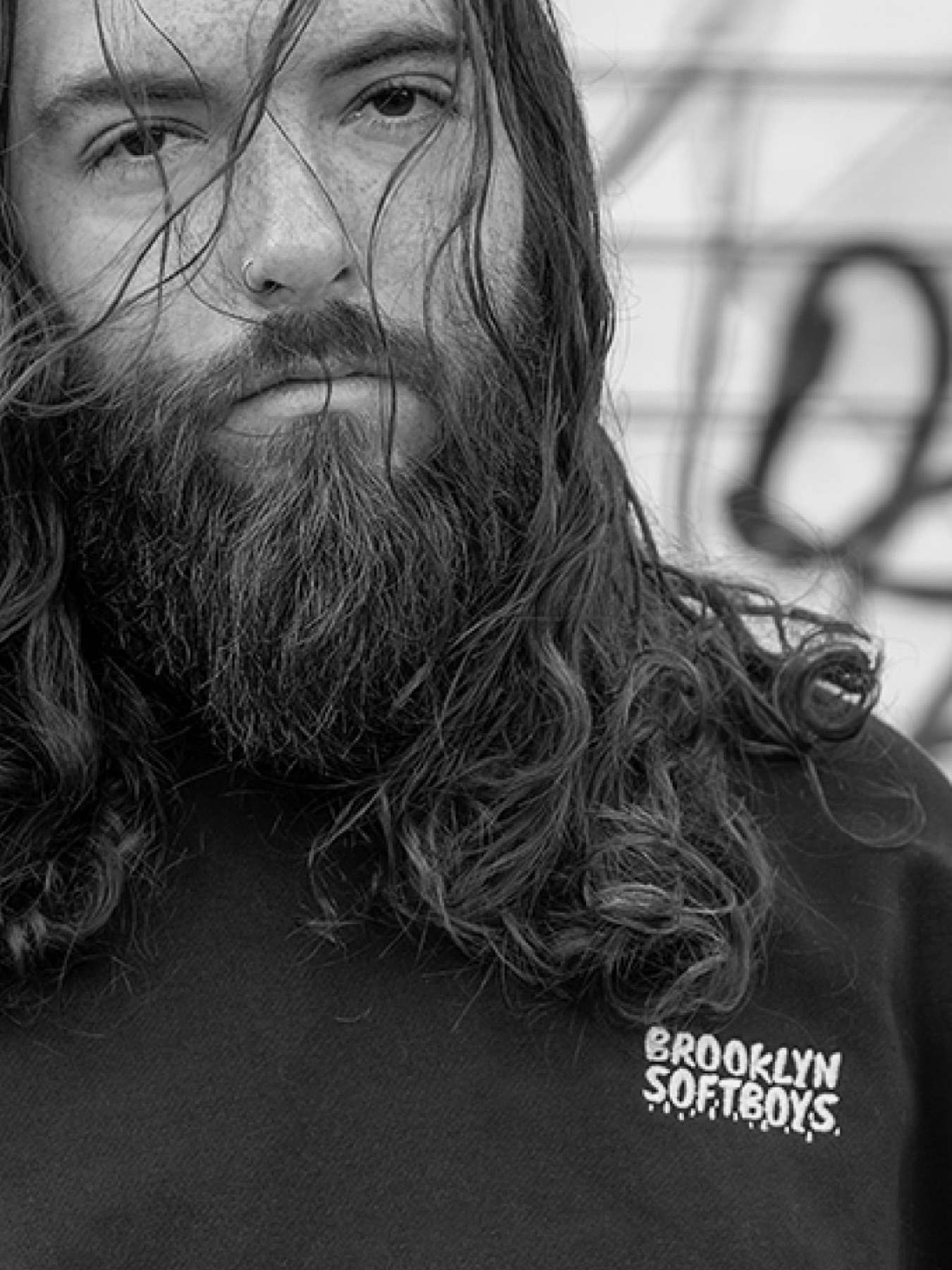
Worn in,
on the street.
Snow banks, steel gates, a pinball bar, a marquee at midnight — the clothes worn in the city they were made for. The garments are the cast; Brooklyn is the set.
Soft launch,
loud grid.
The drop was announced the way it was made: a run of quiet 4:5 teasers for Instagram — grain, a single graphic, one line of type — building from "soon" to "drop is live."
Storefront
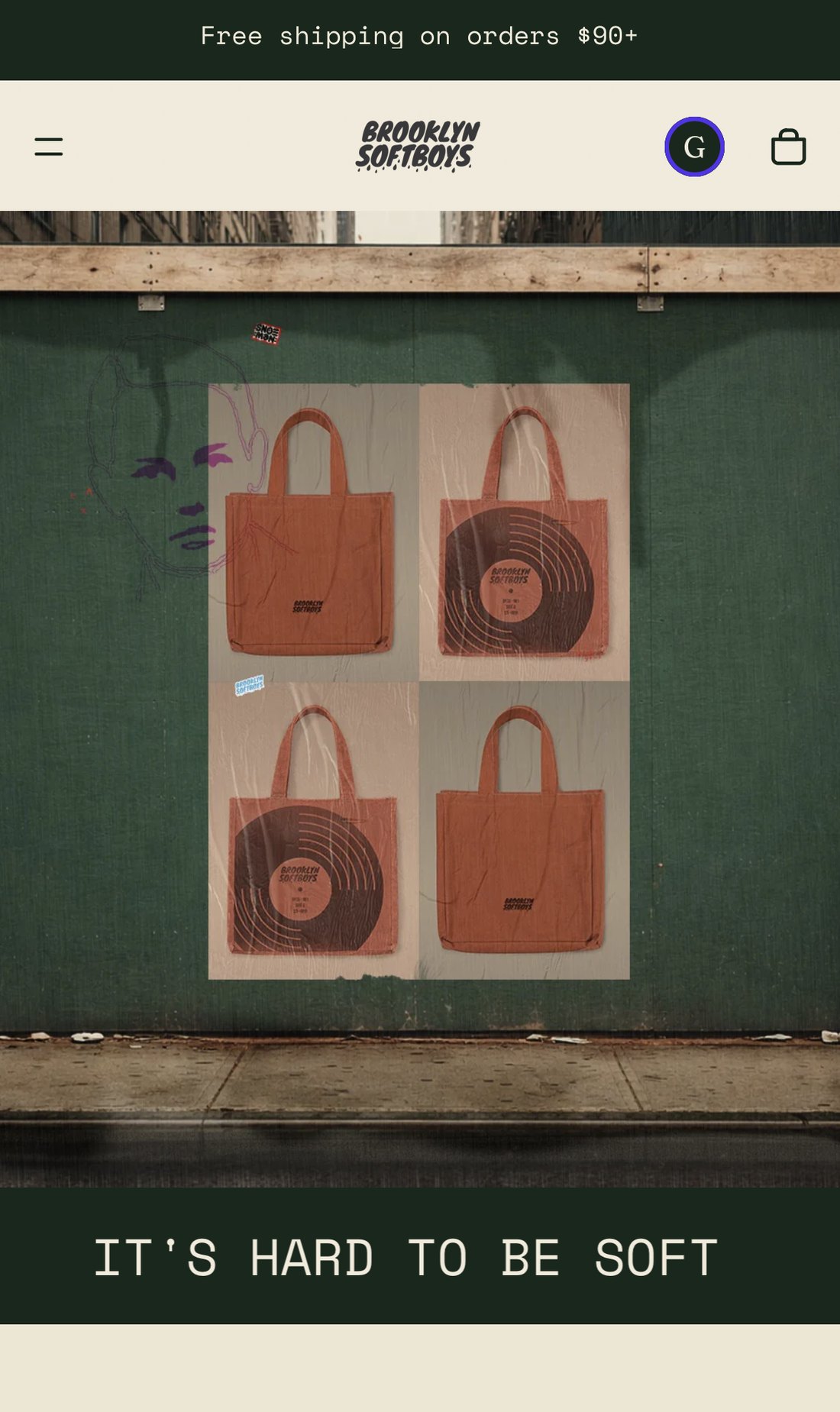
The brand ships on a full Shopify build — the same editorial restraint extended to product pages, so the storytelling doesn't stop at the "add to cart" button. Big type, generous margins, the manifesto never far away.