Zatz
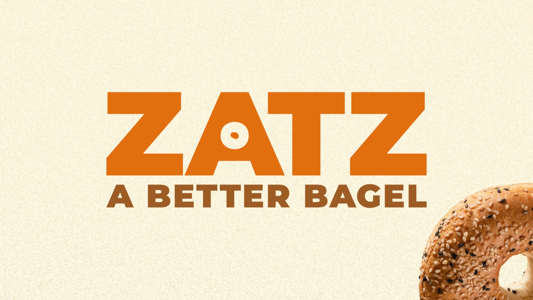
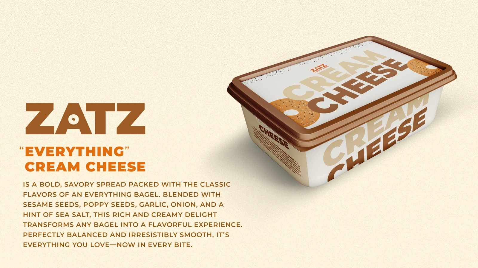
A complete identity for a modern New York bagel concept — deli heritage, cleaned up and set in confident type, from the wordmark to the cream cheese tub.
- Client
- Zatz — bagel concept
- My role
- Designer — logo, identity system, packaging & collateral
- Scope
- Wordmark & type system · palette · packaging · menu & collateral
- Year
- 2025
- Disciplines
- Brand Identity · Logo System · Packaging
Overview
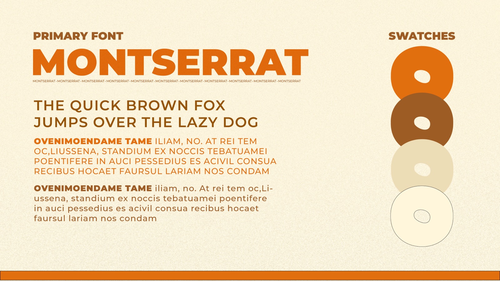
Zatz wants the authority of a hundred-year-old appetising counter with none of the nostalgia tax. The identity leans on a single, characterful wordmark — bold, rounded letterforms with a bagel-ring motif nested right into the mark — balanced by clean, systemised supporting type (Montserrat) so it scales from a business card to a cream cheese tub.
One word,
a whole deli.
The wordmark carries everything — palette, packaging, and collateral — on warm orange-and-cream, set in Montserrat.
Collateral
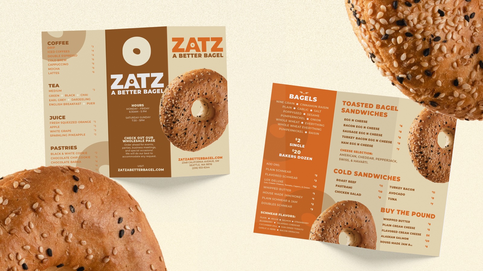
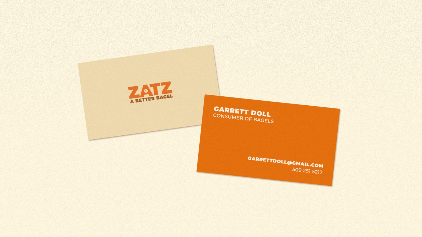
The system runs all the way down to the small stuff — a tri-fold menu with real bagel photography, and a business card that doesn't take itself too seriously. (The back reads "Garrett Doll, Consumer of Bagels.")
Deli heritage without the museum — a bagel brand that looks as good on a napkin as it does on the awning.