Tilly Blair
Photography
An identity for a fine-art wedding photographer — restrained enough to disappear behind the work, considered enough to earn the booking.
- Client
- Tilly Blair Photography
- My role
- Designer & Art Director — identity, type system, client collateral
- Scope
- Wordmark · type & palette · proposal & pricing suite · gallery templates
- Year
- 2023
- Disciplines
- Brand Identity · Editorial & Print · Art Direction
Overview
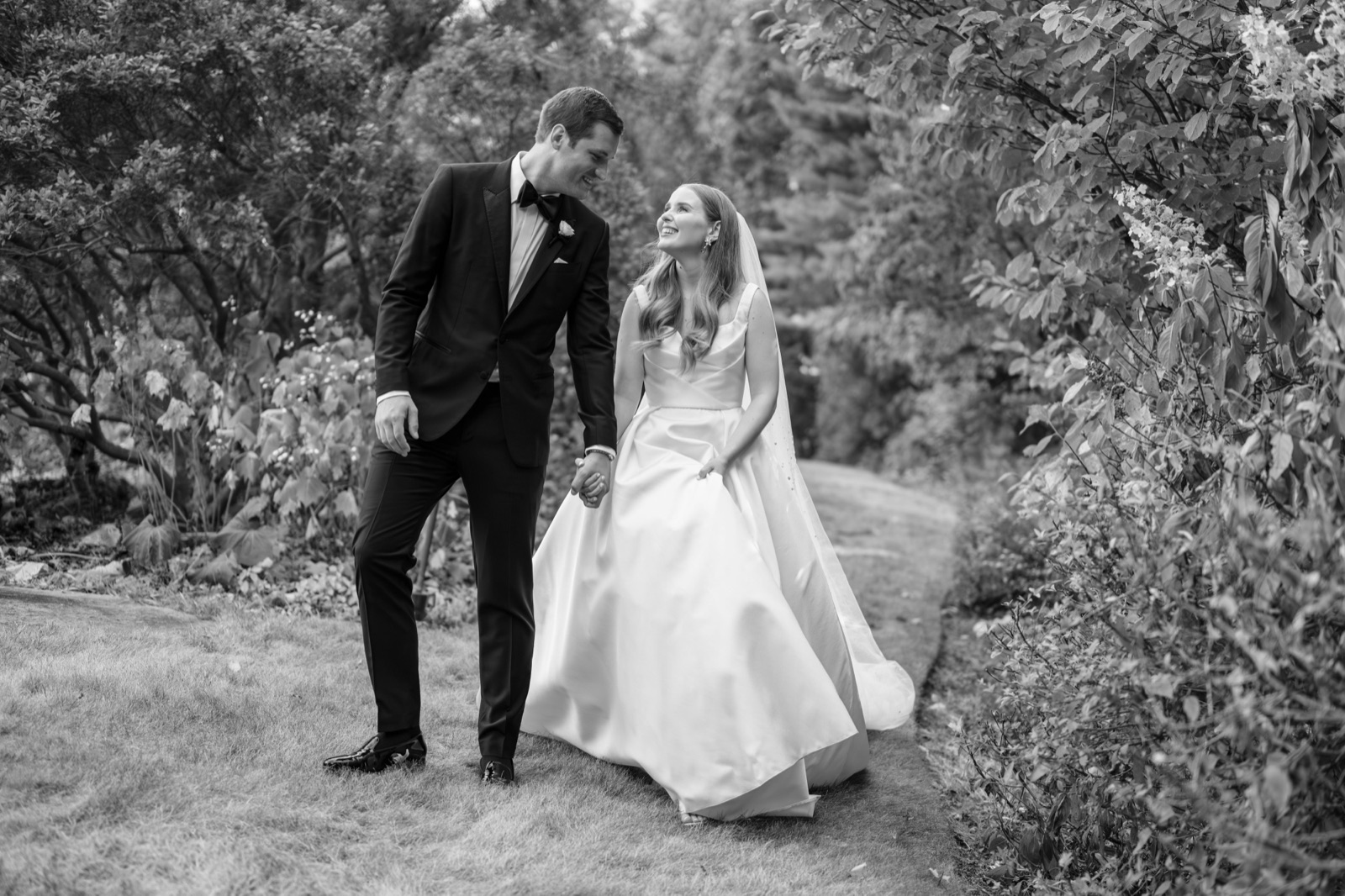
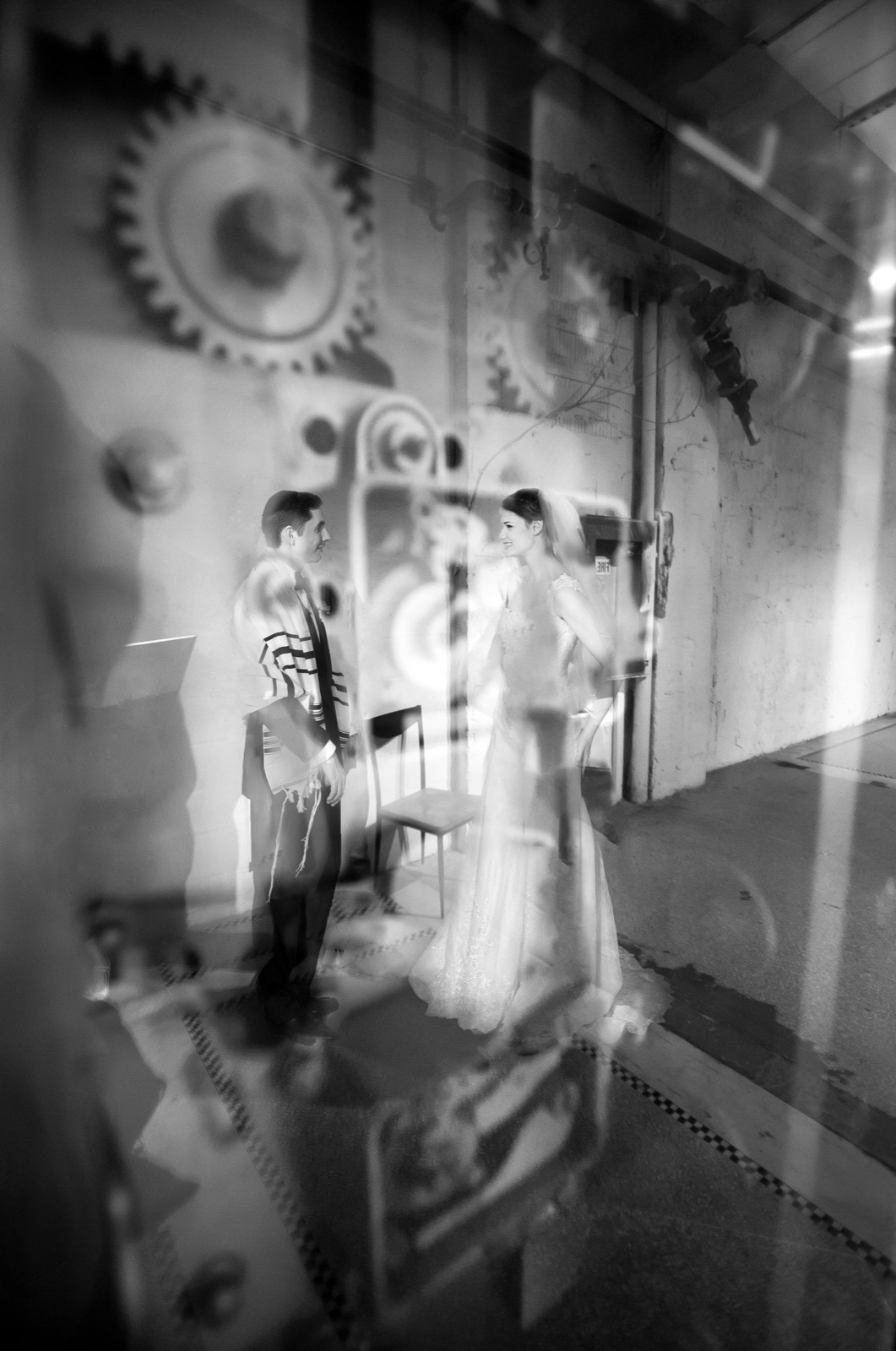
Wedding photography is a crowded, sentimental category. The brief was to build an identity with the confidence of an editorial — one that signals fine-art taste to the right couples and gets out of the way of the photographs themselves.
The answer was disciplined type on generous white space: a clean condensed system (DIN Condensed), a muted greige-and-charcoal palette, and a client experience — from first enquiry to final gallery — that feels like a printed magazine, not a template.
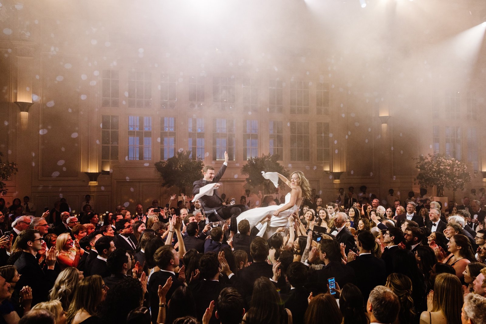
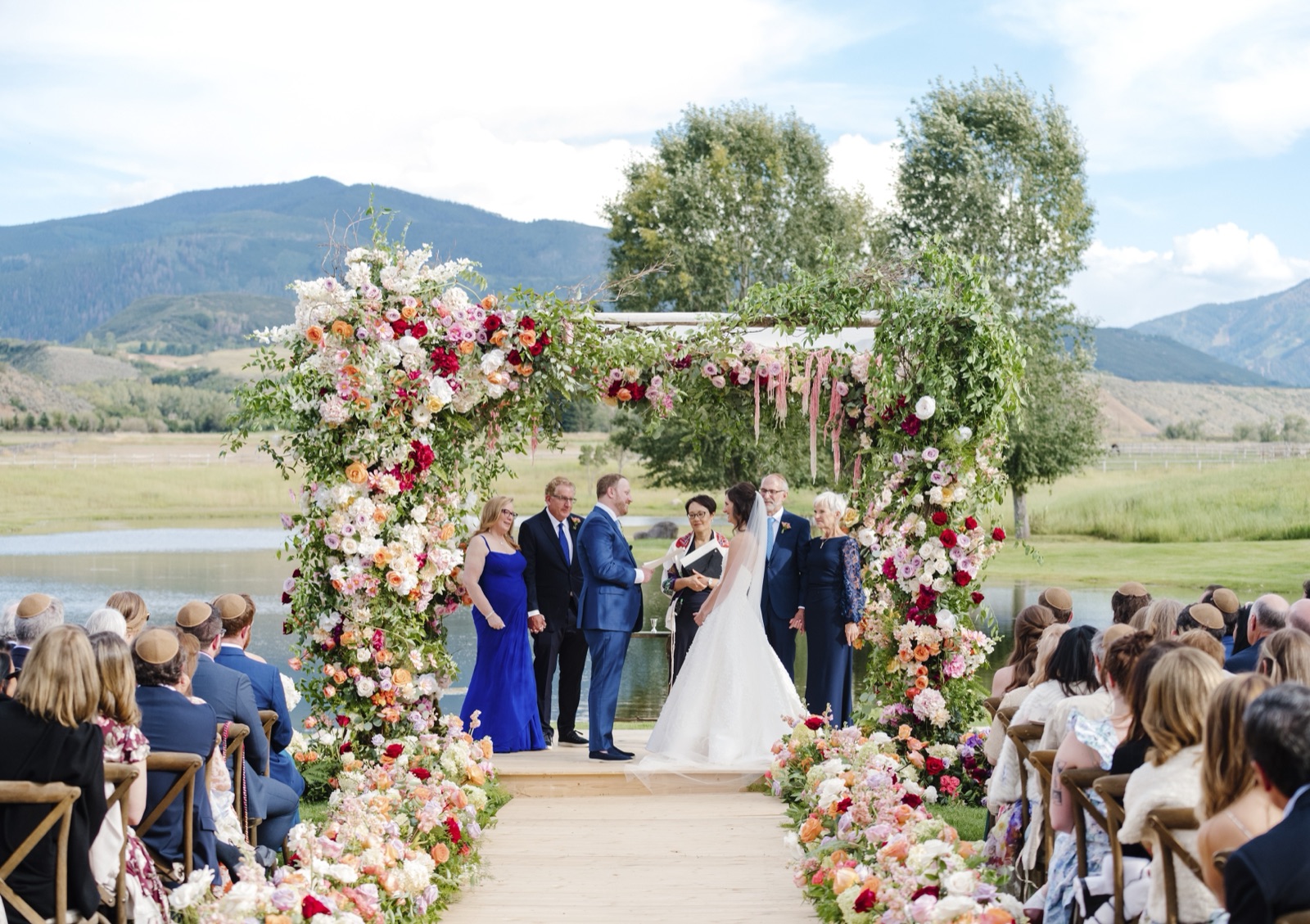
Let the work
hold the room.
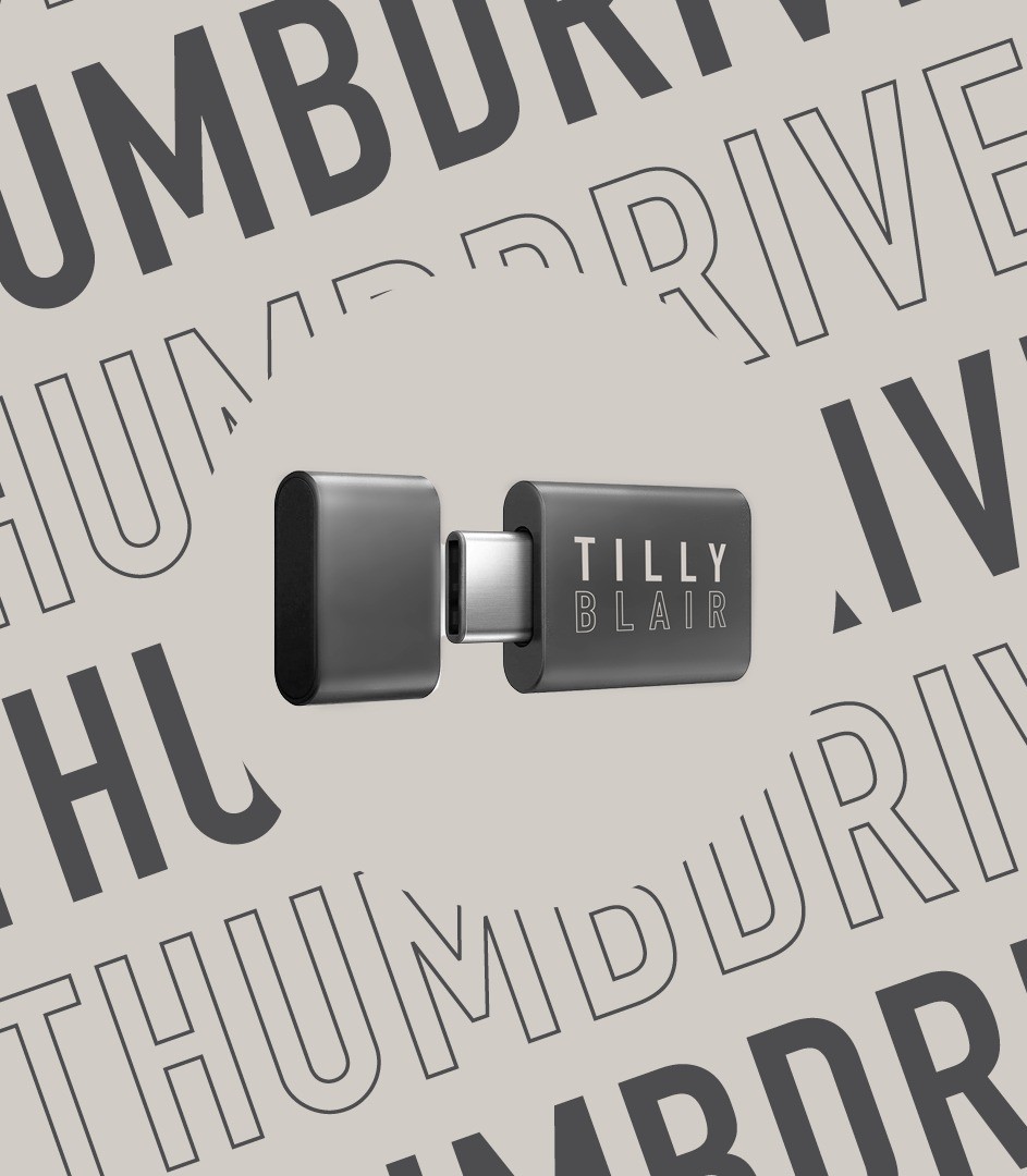
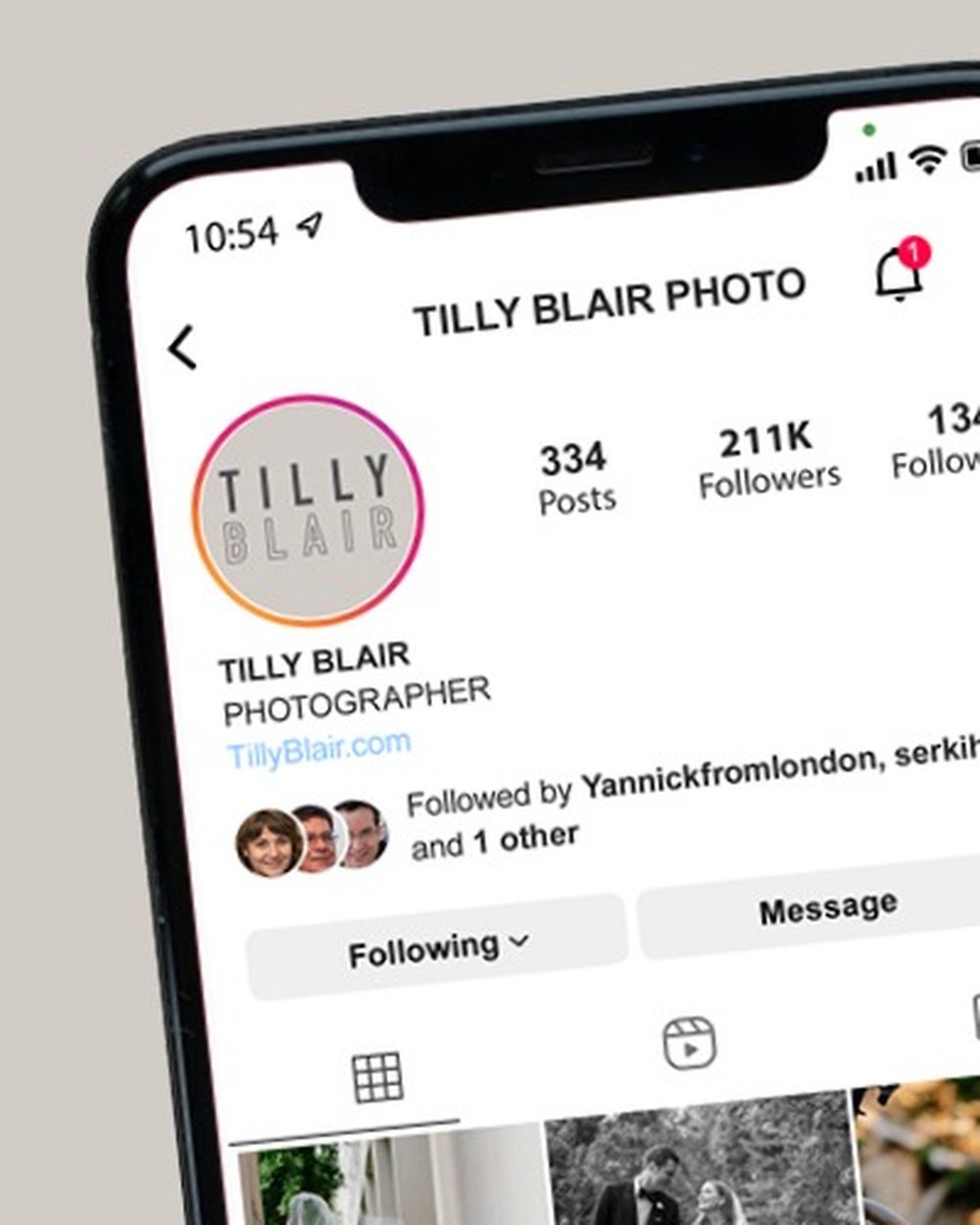
The identity is a frame; the photography is the subject. The system runs all the way out to the collateral — a branded delivery thumbdrive, the social presence — so the brand holds from first enquiry to final gallery.
Type & system
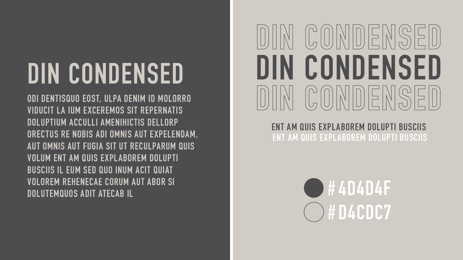
DIN Condensed anchors the voice — architectural, unfussy, quietly modern. Set in tight all-caps for labels and airy title case for headlines, against a two-tone greige palette (#4D4D4F / #D4CDC7). The restraint is the point: it never competes with skin tones or florals.
Client experience
The booking journey is designed as one coherent suite: a cover and welcome, an "à la carte" collections page, the big-day timeline, and a warm goodbye — each a printed-feeling spread the couple actually wants to keep.
A brand confident enough to be quiet — so every eye in the room goes to the photograph, not the frame.